PIVOTAL / MARK McCLURE
Vibrant and dynamic, the unique state screen prints in Mark McClure's latest series represent a pivotal moment in the evolution of his printmaking. To celebrate their launch, we found out more about his burgeoning passion for print, and the liberating joys of colour.


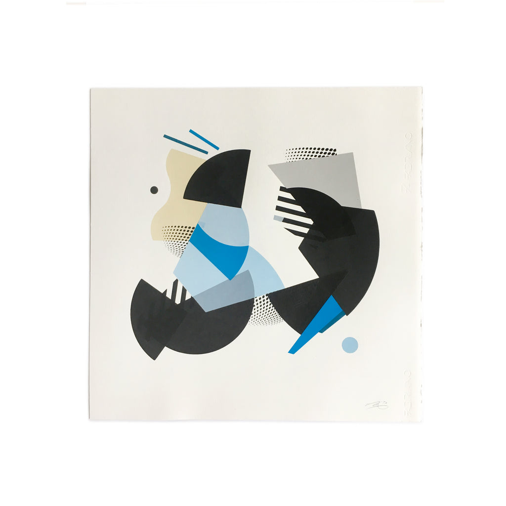
Pivotal Yellow 01 – one of two new monoprints created for Look Up
Look Up How’s it going Mark? How's the work going during lockdown?
Mark McClure Not bad thanks. Staying alert! I seem to be a lot better for not watching Boris’s daily briefings. Cycling a lot, and getting to the studio more lately. I got a few pieces done, and experimented with a few different ways of creating smaller works from home… but I didn’t settle into much of a groove. I got back in the print studio as soon as I could – being lucky enough to have a bike and a place to work without much risk – and I managed to finish off a batch of prints I'd started before lockdown. I also managed to get some laser cutting done, so there’s a few smaller sculptures on the horizon.
Pivotal Yellow 02 – one of two new monoprints created for Look Up
LU You really got the printmaking bug leading up to the lockdown, it must have been frustrating to be stuck at home…
MM Yes, I like to be able to work quite intuitively and quickly, so I was much happier when I got back in the print studio. I enjoy collage and other ways of working, but I much prefer the rhythm and pace of screen printing. I can have multiple pieces on the go at once, allowing for experiments and accidents alongside a set of more planned works; retaining a visual connection across them all by using the same elements on the screens.
LU The printmaking side of your practice has really sparked into life over the last 12 months or so. What changed in your approach to printmaking, and what do you enjoy most about it?
MM I’m starting to relax a bit and roll with the randomness of the process more, and I’m enjoying the role played by transparency, the way it adds an extra element to the colour palette. Eventually, I’d like to make pieces that are as complex and as vibrant as the wooden mosaics I’ve made in recent years, but it’s a gradual process – learning to work with the overlaps and the colours to achieve a similar sense of movement. Unique prints take on their own character, and become more like paintings in some ways… but I especially love the layering of ink on ink to create an embossed or spot varnish effect. It adds a tactile quality to the pieces.
Pivotal Yellow 01 (detail)
LU Let's talk colour. In the past your palettes have been quite minimal, with a tendency to avoid brighter, more vibrant hues. That’s all changed; you seem to choose colours with much more freedom these days. Does it feel liberating?
MM The wooden mosaic pieces I made for my solo show 18 months ago (Pseudo Public at The Foundry Gallery) really pushed that side of things. I made a conscious effort to move towards bolder, brighter palettes.The printing’s taking a while to get up to that vibrancy, largely because of the stuff I mentioned earlier about layering and overlapping. Plus the practicalities of using a lot of colours in screen prints means that it’s taking quite a while to build up my confidence with that technique. But it’s definitely getting there and yes, it’s very liberating!
LU What can you tell me about Pivotal Yellow 01 and Pivotal Yellow 02, the pair of prints we've just launched on Look Up?
MM They’re part of a larger series of Pivotal prints. Each one is unique, but they all use the same set of shapes. For a series of prints, I’ll expose a few screens with different shapes, then I’ll create a number of works using those same shapes. These square format prints reminded me of the graphics you’d see on dance step instructions. The movement around the paper is quite tight and controlled, like a dance, but it’s still visibly obvious. It makes the pieces feel as though they pivot and spin on the spot.
Pivotal Yellow 02 (detail)
LU What's next on the printmaking front? More collaboration with Katy Binks?
MM I’m playing with some smaller unique editions – both colour and black and white – experimenting with some other ideas for new formats. Keep an eye on my Instagram for more on that. And yes, now that lockdown is easing Katy and I hope to get cracking very soon on some new Continuous Cities prints. (since summer '19, Mark and Katy have made several series of collaborative prints, launching their project in our 2019 exhibition, Duets II / Interplay) Katy always manages to push me out of my colour comfort zone, so who knows what we’ll come up with? Whatever it is, it’ll be fun, and probably available through Look Up.
< >
Vibrant, dynamic, kinetic… Mark's new prints represent a significant breakthrough in his printmaking – a breakthrough we are more than happy to celebrate. Normally we'd do that over a few pints in one of Walthamstow's various watering holes, but we'll have to make do with this blog for now... Pivotal Yellow 01 and Pivotal Yellow 02 are now available to buy – only from Look Up.
< >
Prints from Mark McClure’s Pivotal series are also available from Well Hung (having featured in their Construct group show, February 2020), and as part of the Artist Support Pledge initiative. Here’s a small selection of our favourites.
Pivotal 02 – available from Well Hung

Pivotal Red 03 – available as part of the Artist Support Pledge initiative

Pivotal Blue 04 – available as part of the Artist Support Pledge initiative
< >
Mark McClure's Look Up collection
Mark McClure on Instagram
markmcclurestudio.com
< >